Overview
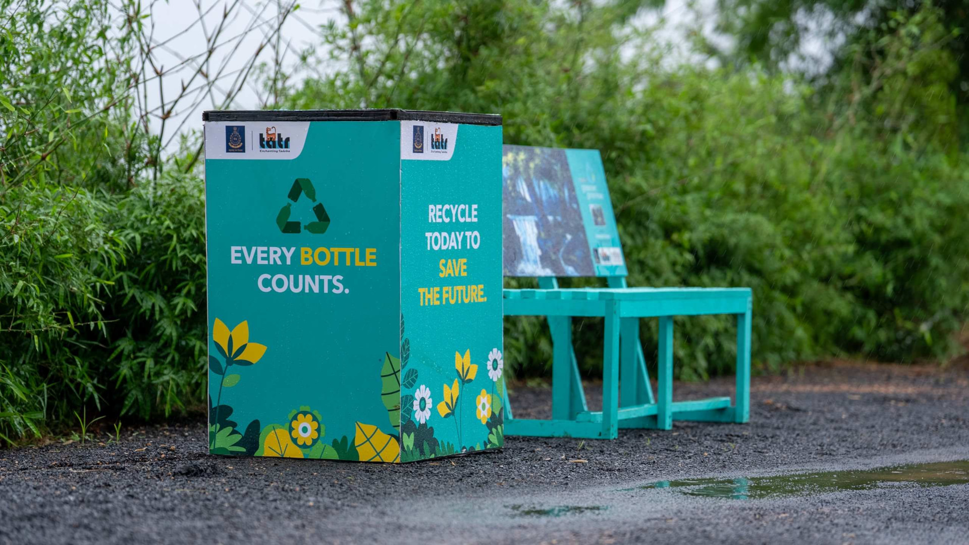
Bottles for Change is Bisleri's flagship circular economy initiative. A nationwide effort to collect, recycle, and repurpose plastic bottles into everything from planters to park benches. The movement was real and the impact was real. The problem was that almost none of it was visible.
I was brought on as the senior UX designer to give Bottles for Change a web presence that could do what word of mouth and CSR reports couldn't: make the initiative feel credible to skeptical partners and inviting to the people who needed to opt in: households, schools, housing societies, corporates, and NGOs. There was no existing site to iterate on. I owned the project end to end, from stakeholder interviews and competitive research through final UI, and the site has since launched to strong internal and client feedback.
Trust isn't a design style, it's a design architecture. It gets built by pairing hard numbers with human stories, and by making every claim easy to verify.
That principle shaped every major decision on the site, from the homepage down to the footer.
The Challenge
Sustainability initiatives have a credibility problem. Anyone can put a recycling icon and a green gradient on a website and call it an impact story. Bisleri needed something that didn't read like marketing. It needed to read like evidence.
The brief, in essence, was: build a website presence so Bottles for Change becomes a reliable, trustworthy movement with complete transparency. That's a research and information architecture problem before it's a visual one. My job wasn't to make recycling look nice. It was to figure out what a first time visitor, a wary corporate partner, and a Bisleri stakeholder would each need to see before they believed this was a movement worth joining.
First time visitor
Is this real, and what do I do next?
Corporate partner
Can I verify this before I align my brand?
Bisleri stakeholder
Is our work finally being told properly?
Research & Discovery
I started by asking a deceptively simple question: what actually makes a sustainability initiative feel trustworthy online, versus performative? To answer it, I ran two parallel tracks.
Track A
Competitive audit
Other CSR and circular economy sites, how organizations in this exact credibility deficit space present proof of impact, and where they fall short by either drowning users in jargon or offering vague, unverifiable claims.
Track B
Stakeholder interviews
Sessions with the Bisleri team to surface what proof points actually existed behind the scenes: collection data, partner networks, on the ground events, product outcomes, and which of those stories weren't being told anywhere.
Two clear findings came out of this phase, and they became the two pillars of the entire site.
Finding 01
Stats build reputation
Concrete, specific numbers: bottles collected, collection centres active, tonnes diverted from landfills, schools engaged, read as evidence in a way that adjectives like “impactful” or “sustainable” never do. Precision signals that someone is actually measuring, and measuring signals accountability.
Finding 02
Real stories build belonging
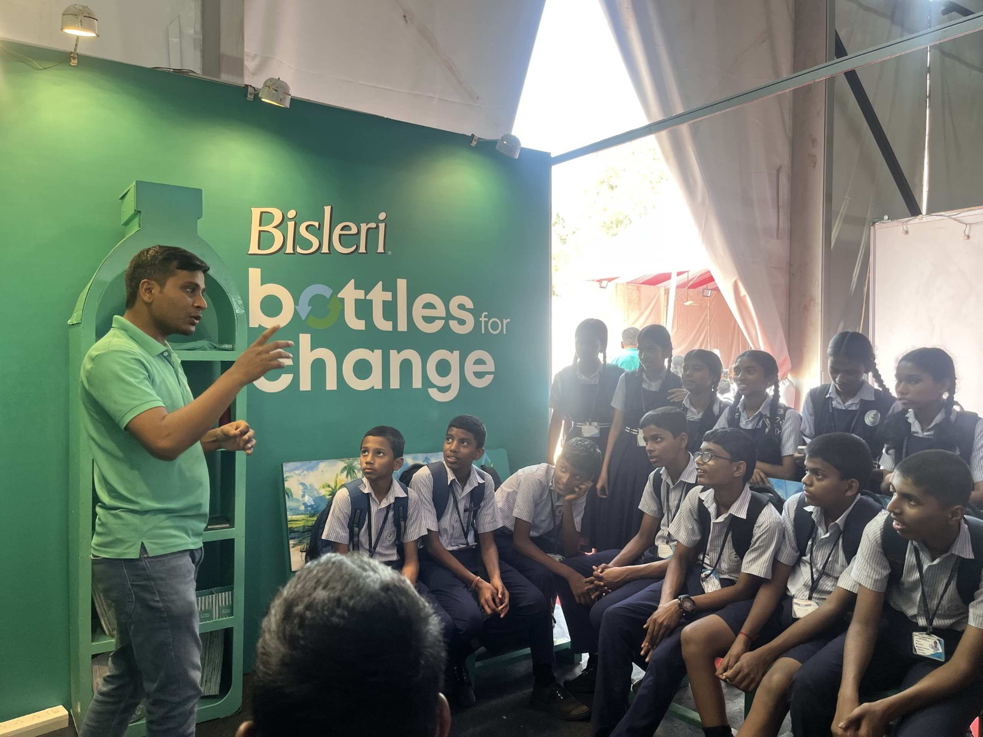
Numbers alone can feel clinical. What made people want to join rather than just believe was seeing real people: schoolchildren sorting bottles, communities at events, benches installed in actual neighborhoods. Stats prove the movement is real; stories make it feel like something you're invited into, not something happening at you.
Designing for Transparency
Turning impact into proof, not decoration
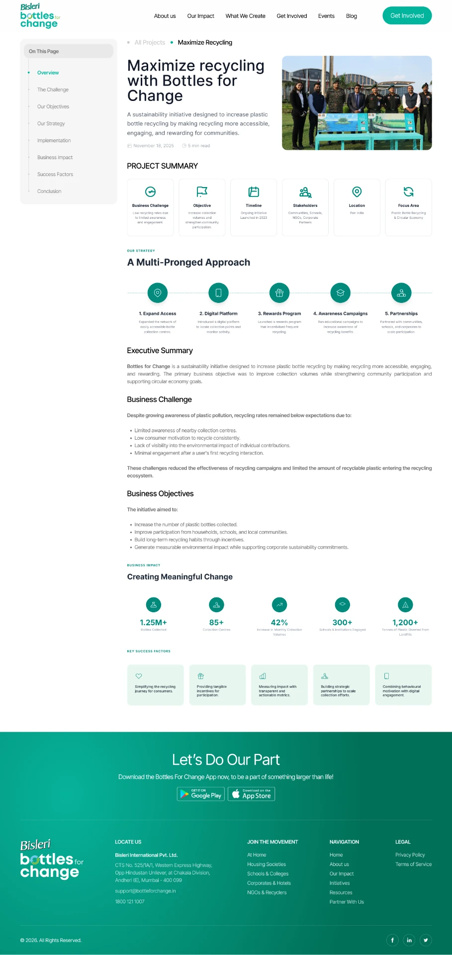
Rather than tucking impact metrics into an "About" page as a token gesture, I made data the backbone of the Projects section. Each individual project page, like the "Maximize Recycling with Bottles for Change" case study, follows a consistent, almost documentary structure: the business challenge, the strategy, and then hard numbers.
I deliberately designed this like a mini case study rather than a blog post. Complete with a sticky table of contents sidebar, a strategy timeline, and a "Key Success Factors" breakdown. The intent was to let corporate and NGO partners self serve the due diligence they'd normally have to request in a meeting. If a partner is evaluating whether to align with Bottles for Change, they shouldn't have to take our word for it, they should be able to read the numbers themselves.
Letting the movement show its face
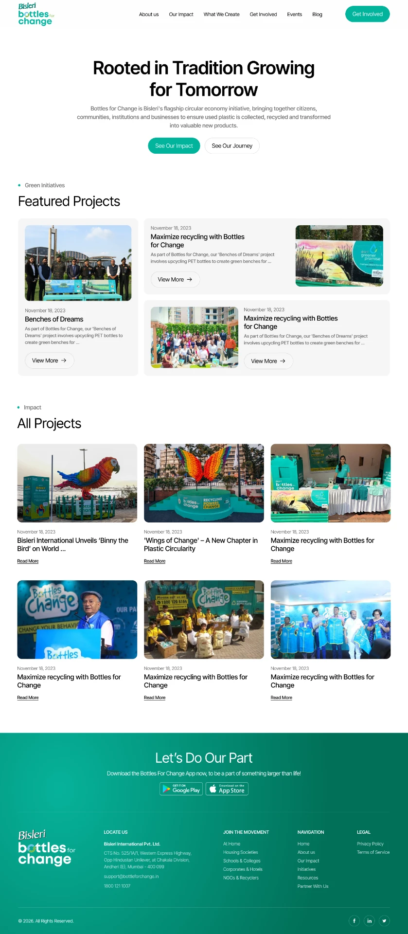
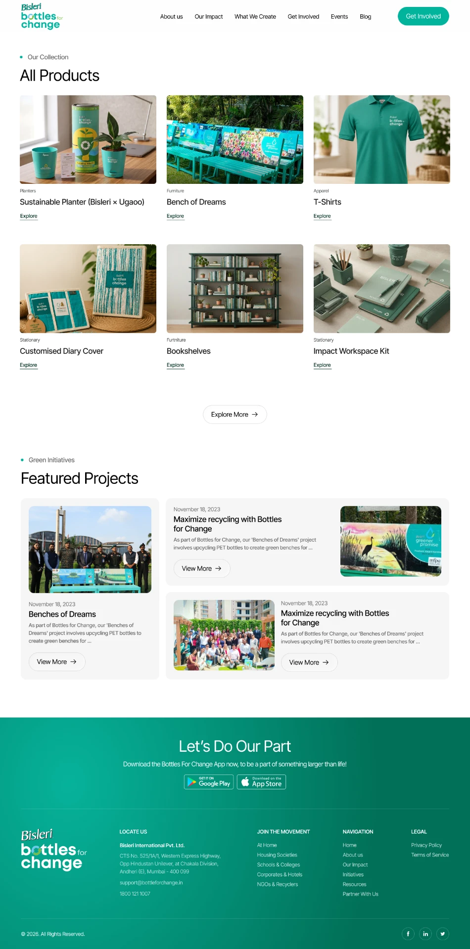
The Projects listing page pairs data driven storytelling with a gallery of real, on the ground moments: installation events, community gatherings, school drives, each with a date and a short narrative rather than stock photography. I structured this as a featured item plus grid layout specifically so the people of the movement, not just its outputs, would be the first thing a visitor scrolls through. Trust in a cause is rarely built by statistics alone; it's built by seeing that other people, in real places, already believe in it too.

Making the "waste to product" journey tangible
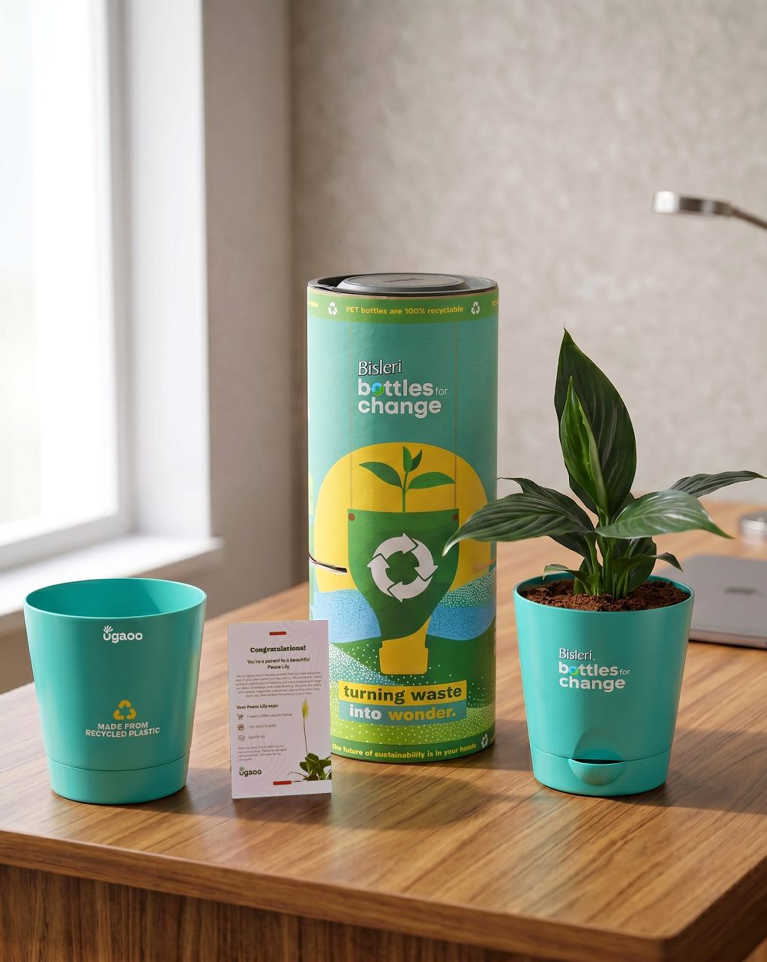
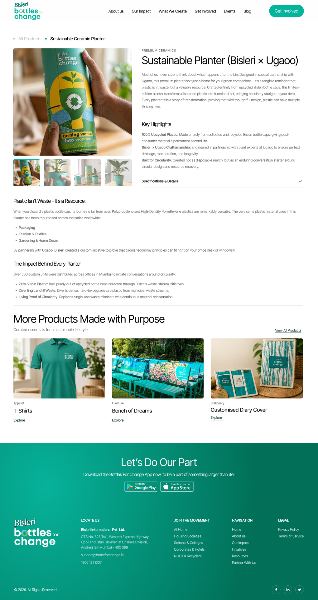
For the product pages: items literally made from collected plastic, like the Sustainable Planter built in partnership with Ugaoo. I designed the layout around a before/after narrative: what the plastic used to be, what it becomes, and the specific material journey behind it. Each product page includes an "Impact Behind Every Product" section with its own concrete stats, extending the same evidence first principle down to individual SKUs. This was a deliberate choice to prevent the products section from feeling like disconnected merchandise. Every item had to visibly trace back to the same transparent supply chain as the recycling data.
Material journey
- WasDiscarded PET bottle caps
- BecomesSustainable Planter, with Ugaoo
- Made of100% upcycled bottle caps
- EngineeredWith plant experts, for real functionality
Removing every barrier to verification
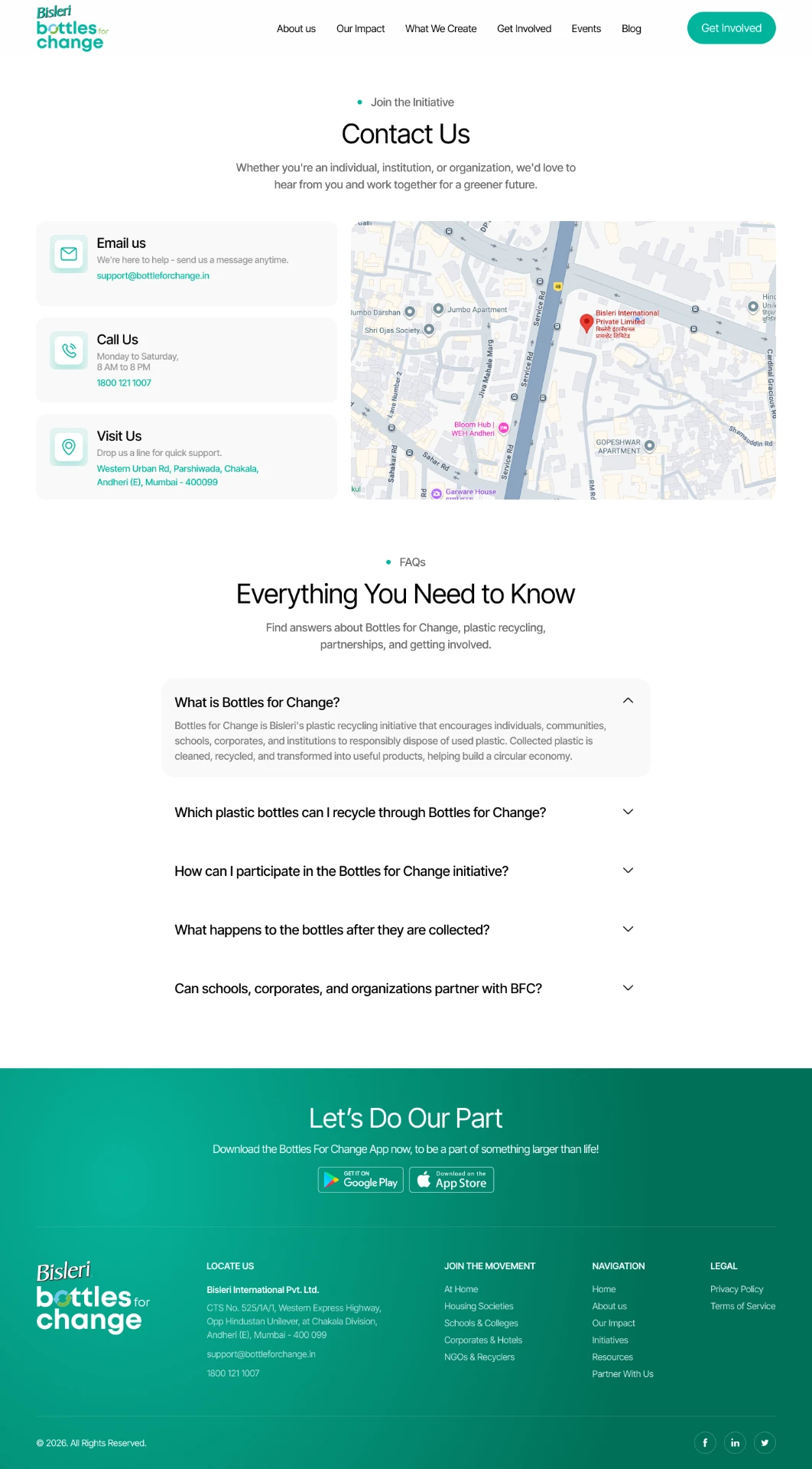
Trust also comes from access. On the Contact page, I designed three parallel, equally weighted channels: email, phone, and a physical address with an embedded map, alongside a detailed FAQ addressing the questions a skeptical or curious visitor would actually ask: what counts as recyclable, what happens to bottles after collection, how schools and corporates can partner. The goal was to leave no gap between "I'm curious about this" and "I can immediately act on it."
The Screens
Six surfaces carry the trust architecture end to end, each one pairing measurable proof with the people behind it. Scroll inside any frame to read the full page.

Outcome & Reflection
Bottles for Change is live, and the response from Bisleri's team and stakeholders has been strongly positive. The site is now the primary reference point they point partners, schools, and corporates to when introducing the initiative, replacing what used to be a scattered mix of decks and press mentions.
What I'm proudest of isn't any single screen, it's that the trust-building thesis I landed on during research (stats for credibility, stories for belonging) shows up consistently across every part of the site, from the homepage down to a single product's specs. That consistency is what separates a site that looks trustworthy from one that actually functions as evidence.
Transparency is a content and IA problem long before it's a visual one.
The instinct on a sustainability project is to reach for green gradients and leaf icons. The real work was figuring out what proof to surface, in what order, and how to make every claim on the site something a skeptical visitor could verify for themselves, and then getting out of the way and letting the numbers and the stories do the convincing.